YEAR
2020
ROLE
UX Design, UI Design
I was the lead UX designer on an multidisciplinary Agile team. I was responsible for shaping the overall design direction of this project and collaborating with the entire team throughout the project.
With access to the biggest brands and stocks in designer luxury,
Desilux negotiates deals with top luxury brands, offering members
substantial discounts, often 50% to 90% below retail prices.
However, due to the exclusive approach, customer retention was low.
Compared to current competitors and the rise in use of mobile retail
apps, we knew that this was an important problem to solve. A failure
to deliver a better solution posed a risk of losing our current
customer base. Here's an overview of my role in leading the UX
design process.
Using the double diamond model as a visual representation of the design process - my process started in the middle with a user flow and various ideas sketching.
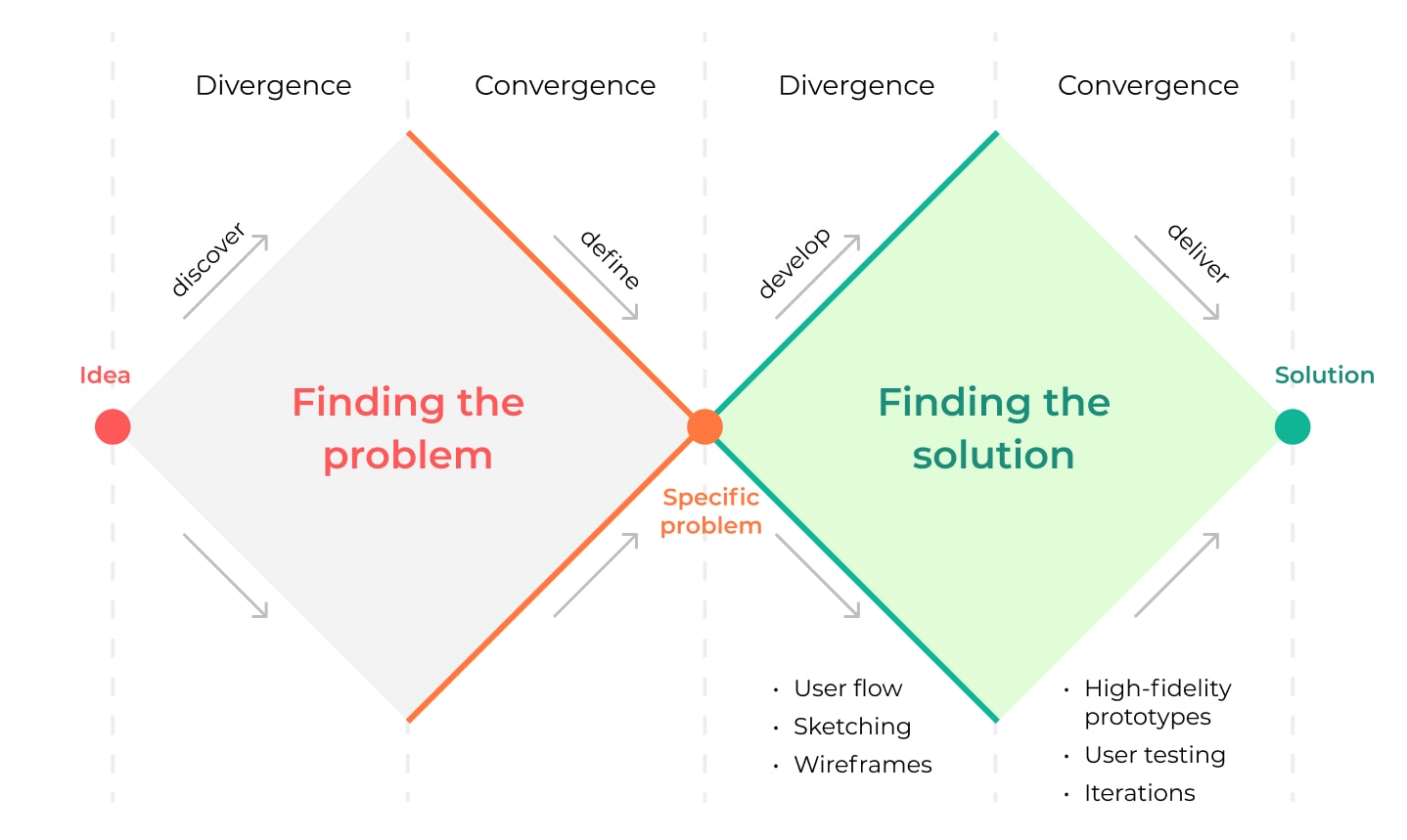
Double Diamond Diagram
I started off the design process with a basic user flow to help me understand the possible user navigation through the web app. Initially the user had to sign up in order to see the content, but this turned out to be discouraging so we eventually removed this step. The goal was to get users to sign up and to for the gold membership.
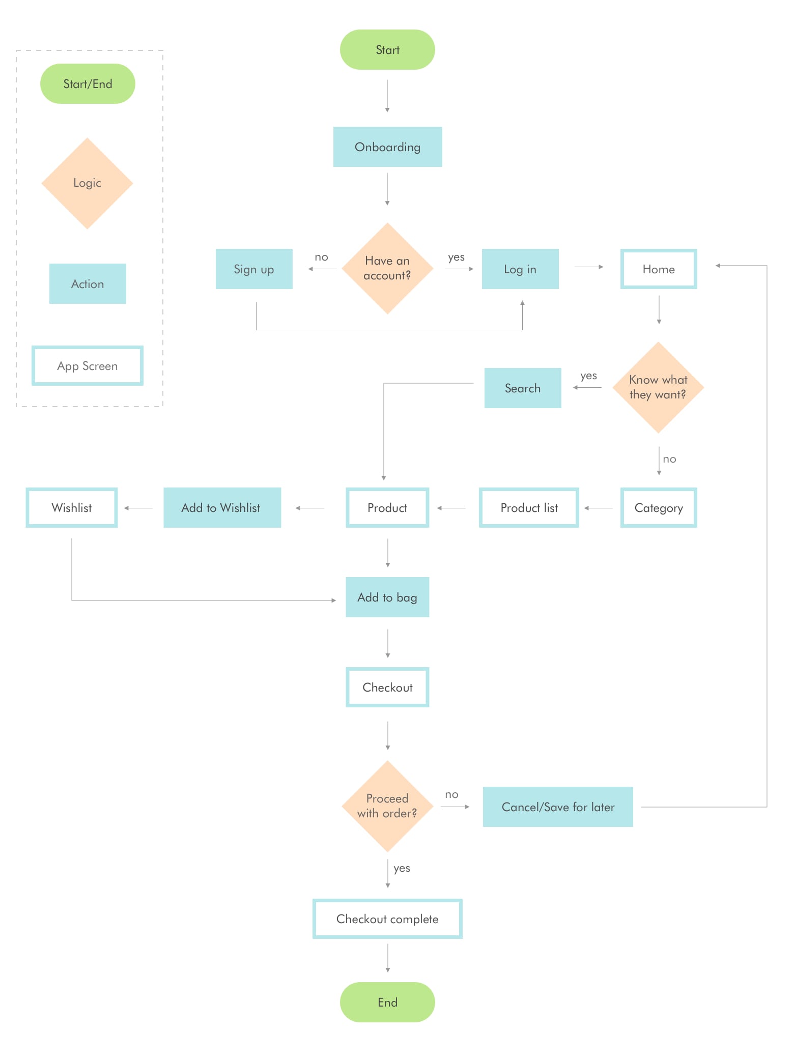
User Flowchart
In this step I also did a brief analysis of the current competitors which helped me pin down the most common visual design elements and UI patterns.
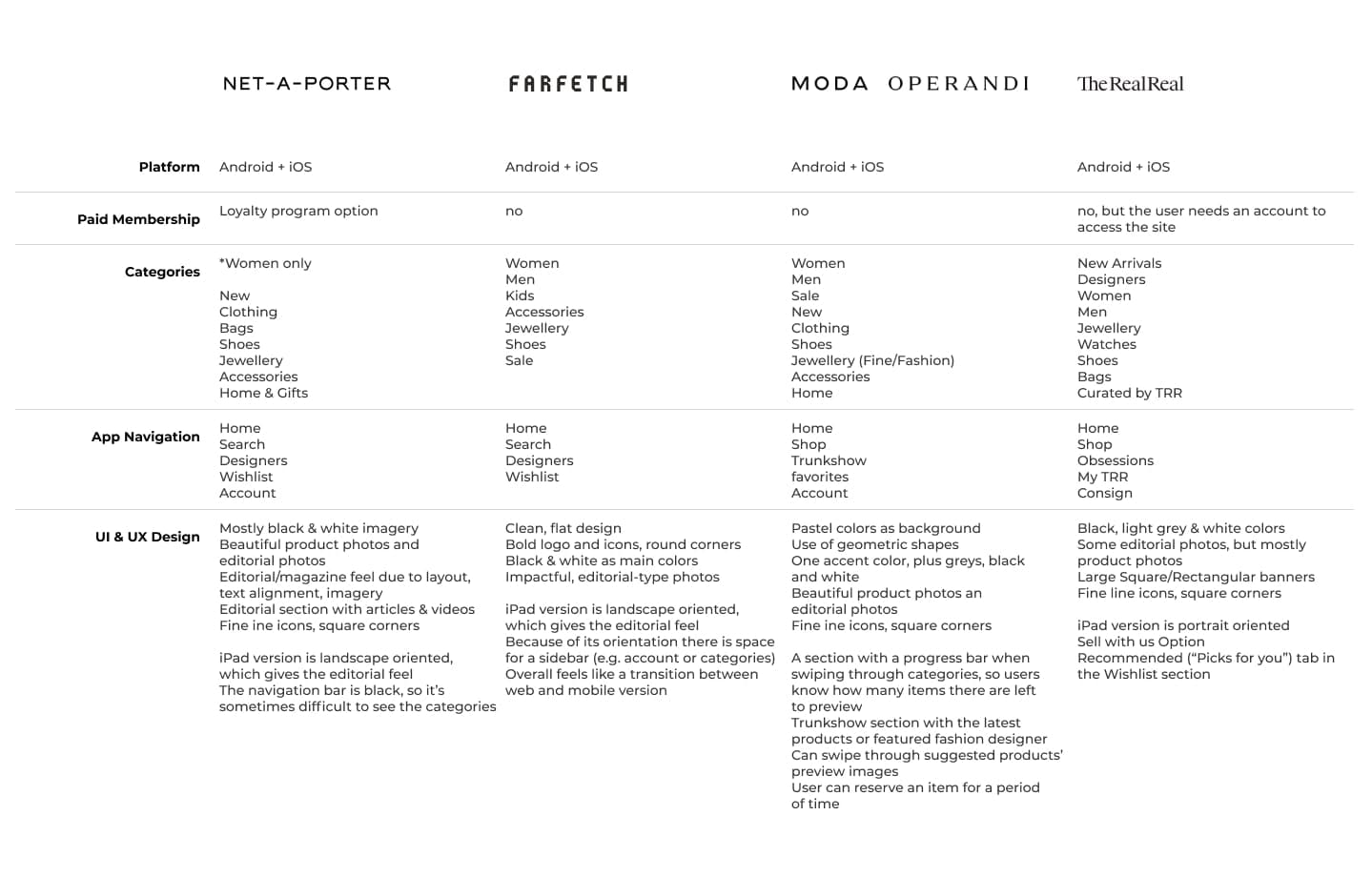
Competitor Analysis
Next step in finding the solution was to generate different designs
based on our observations and the client's feedback. After we
narrowed down the general direction, we started designing different
variants for the landing page.
We ended up going for the third option although I wish we went for
something more like the second. I think having too much content on a
landing page can bore the user. The goal is to keep them engaged and
have them sign up and shop, so I think having fewer sections with
some editorial photography and maybe some products would do a better
job.
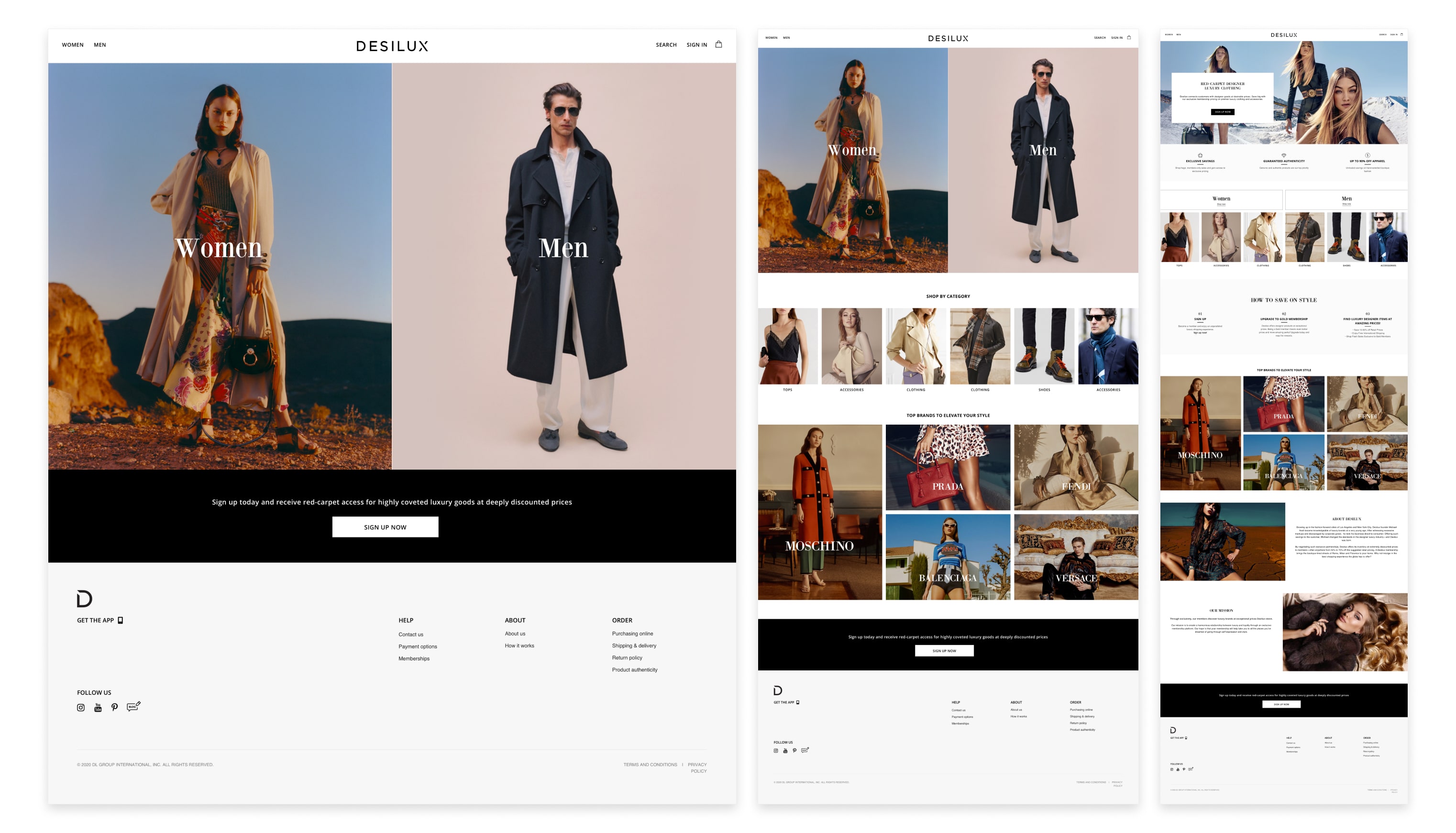
Landing Page Evolution
I was presented with an idea of Flash Sale events with the purpose of keeping customers engaged. I designed a few versions, one of which was a main events page, displaying an current and upcoming event listing, where the user could choose to be notified in advance. However due to time constraints and technical complexity, we had to let go of the notification feature. We kept the multiple events feature that could be displayed as hero banners or within the product listing.
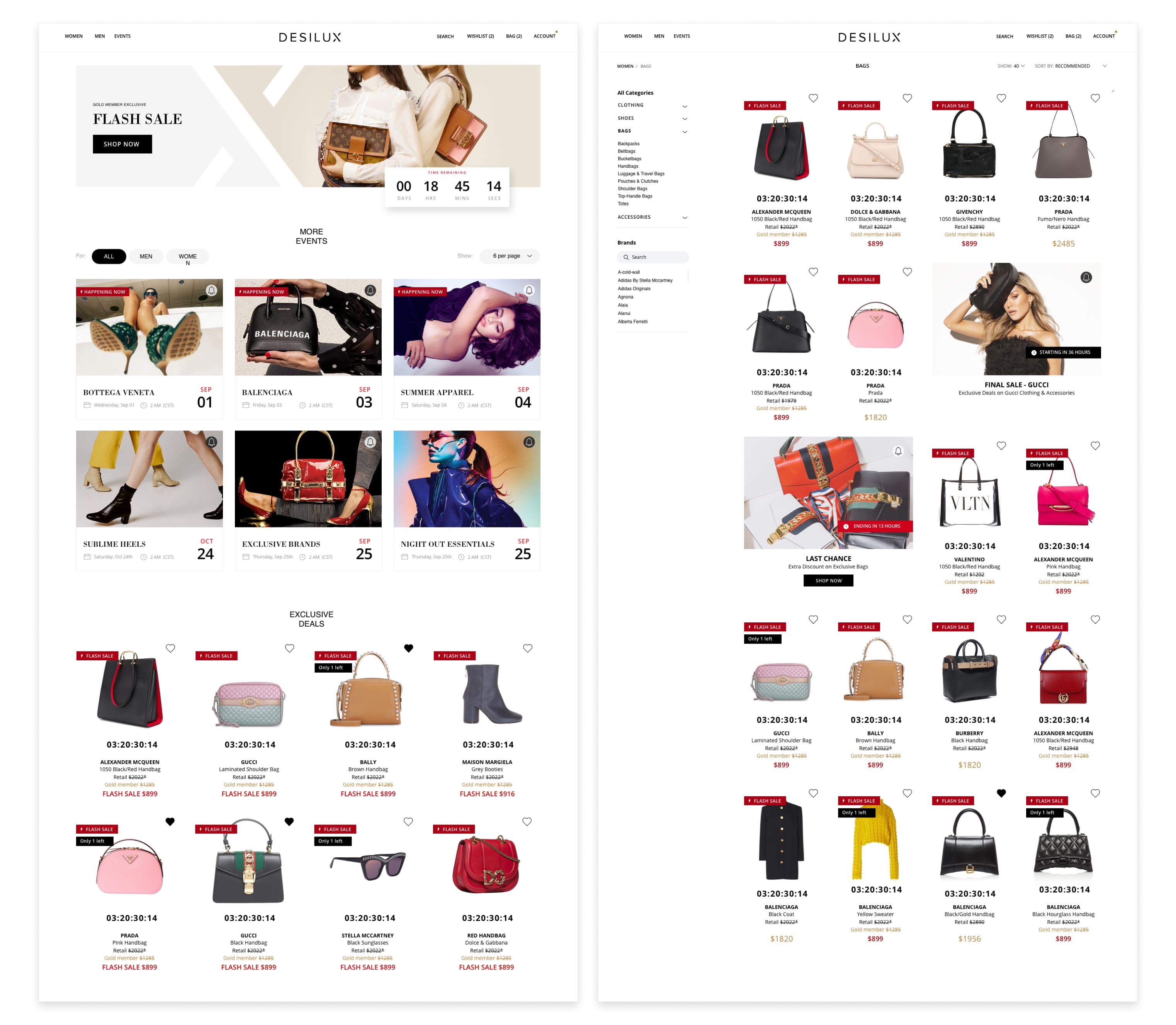
Flash Sale variants
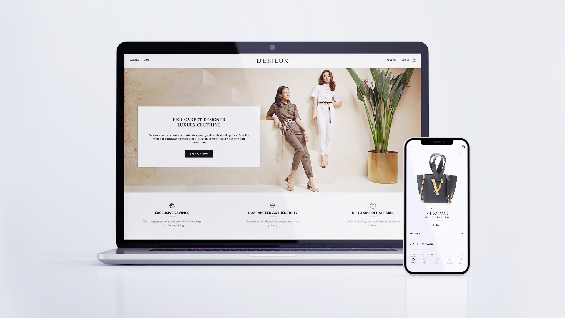
The deliverables were a refreshed web app and an iOS app.
Unfortunately, at the time, I had no access to metrics so I can only
assume the impact of my work. If I were to redo this project I would
prioritize data driven design.
Also, since we had many good ideas but no time to implement them, I
would do early usability testing to determine which areas are more
useful, and where we can cut our losses.
As for the next steps, I would monitor reviews and downloads and use
this feedback to iterate on the product's next release.
NEXT