
YEAR
2025
ROLE
UX Design, UI Design
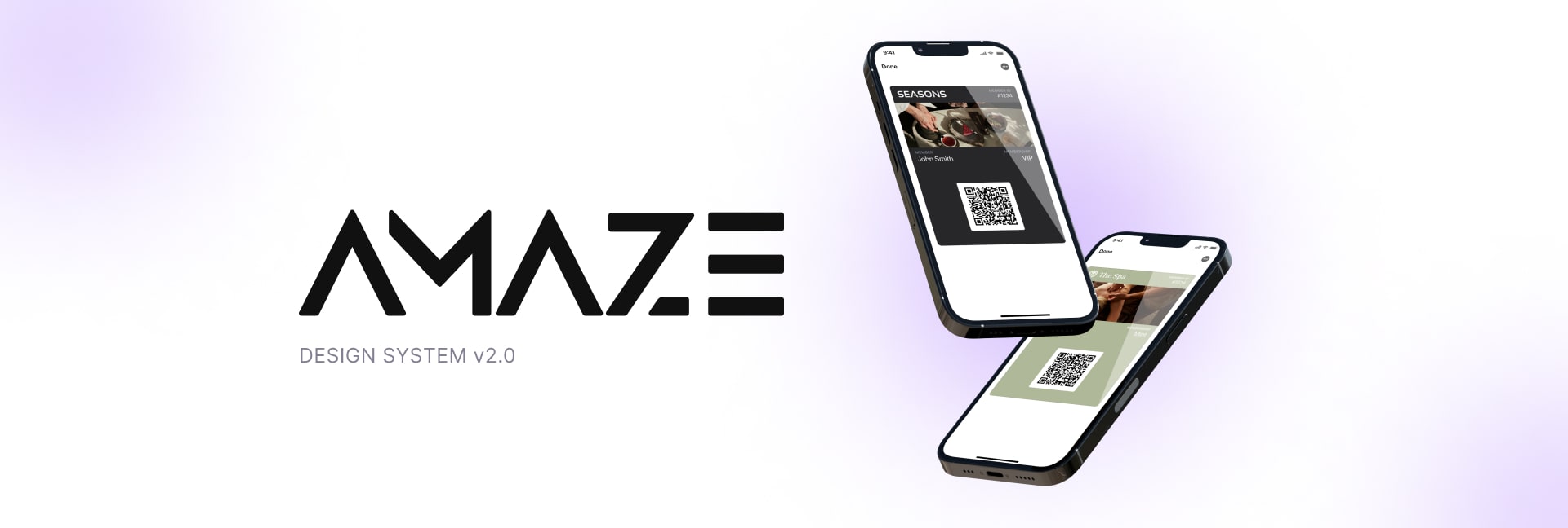
Amaze helps businesses create custom loyalty and membership
programs. It's a white-labeled platform for industries like retail,
hospitality, and e-commerce, allowing brands to build engaging
experiences that boost loyalty and revenue.
As the company grew,
design inconsistencies
and
UX challenges
started to impact user experience and development efficiency.
This case study explores how
I built a cohesive design system for Amaze,
bringing consistency, improving workflows, and strengthening
collaboration between designers and developers.
I inherited the project with
no existing design system or component library.
The developers had been working on their own for a while, so by the
time I jumped in, things were all over the place.
There were different components doing the same thing,
and lots of
UI issues
like spacing, font sizes, and using hex codes for colors.
All these inconsistencies kept piling up, creating extra work and
leading to a lot of back-and-forth between me, the front-end team,
and the client.
In the brief time that I worked on this project I managed to set up
a component library (Amaze DS v1.0) but new components kept popping
up from nowhere, buried deep in the app.
It felt like the myth of Sisyphus: everyone was working hard, but
the results just weren’t adding up.

We needed a design system that would set principles, define a visual
language, and organize the component library so we could keep track
of everything
Since we were on a budget, I looked into open source libraries:
This approach helped bring some structure to the chaos.
Building the design system was a tough task, but I had great support
from both the client and the team.
However, there were some challenges:
To tackle this, I paused new feature design for this client and focused on research and building the component library.
Design Tokens
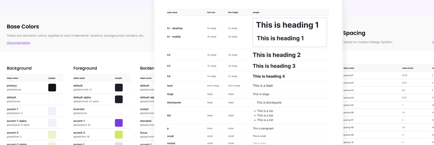
First, I started building the tokens:
This approach laid the groundwork for the design system, but it definitely took time and patience.
Tokens
Assets & Components
I then started building our library by redesigning and adding
components from the app, using ShadCN's library as a foundation.
To keep everything organized, I listed them in a table with a status
label (like Healthy, Known Issues, or Deprecated, In Progress etc)
so we always knew what needed attention.
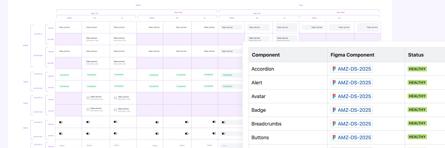
I listed each component with a status like Healthy, Known Issues, or Deprecated, In Progres etc — so we always knew what needed attention
Documentation
I set up the documentation on Confluence since we were already using
Atlassian. At the time, this was enough to help us move in the right
direction.
I defined a list of design principles, a visual language and general
guidelines for the team to follow. This should help reduce
back-and-forth and make collaboration more efficient.
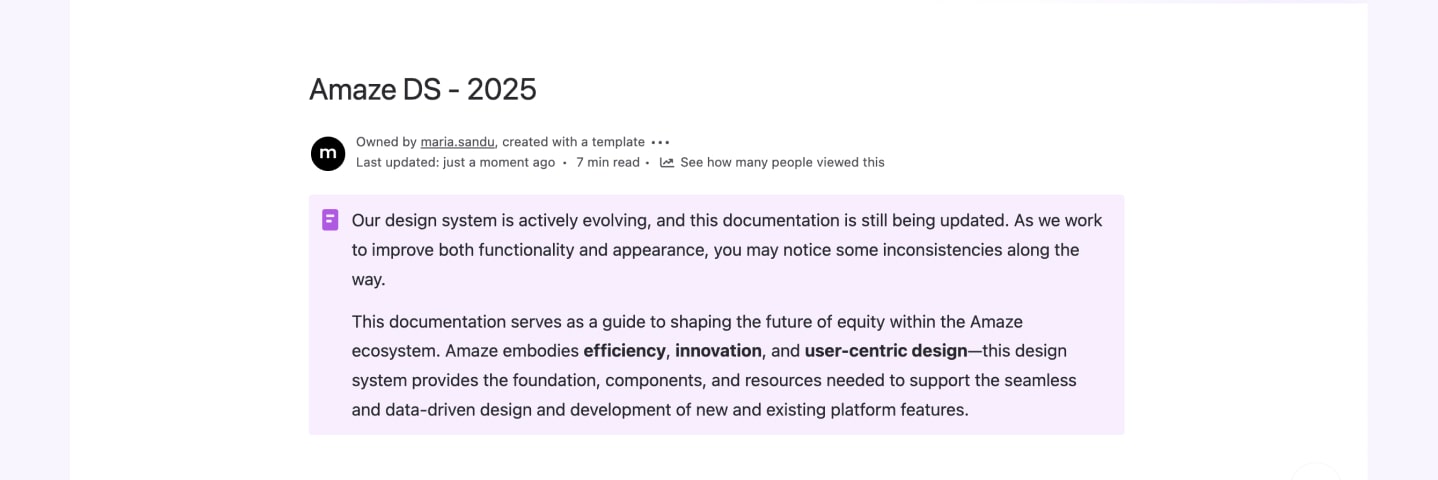
The design system is already improving workflow by reducing
inconsistencies and streamlining collaboration.
With a component-first approach, the team can cut down on
back-and-forth, avoid redundant redesigns, and simplify feature
development.
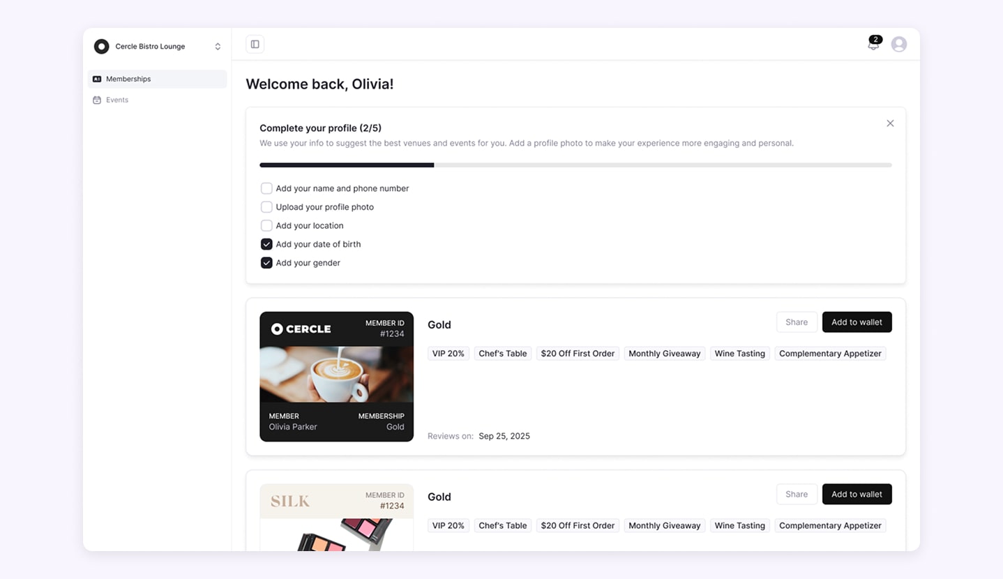
Customer-facing platform
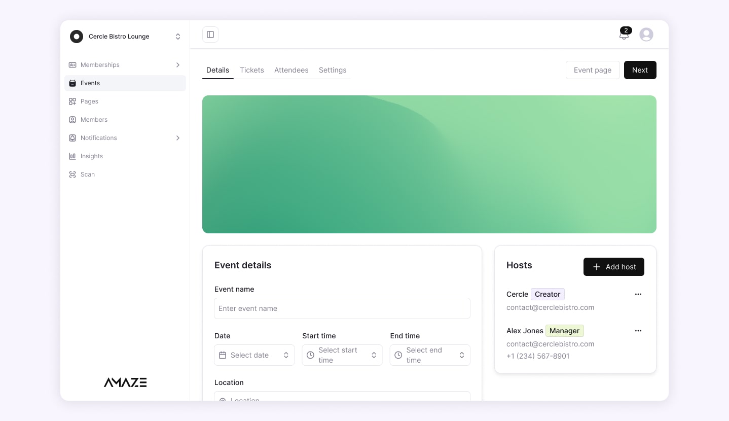
Business-facing platform
In conclusion, this approach makes the design process more efficient
and scalable for the long run.
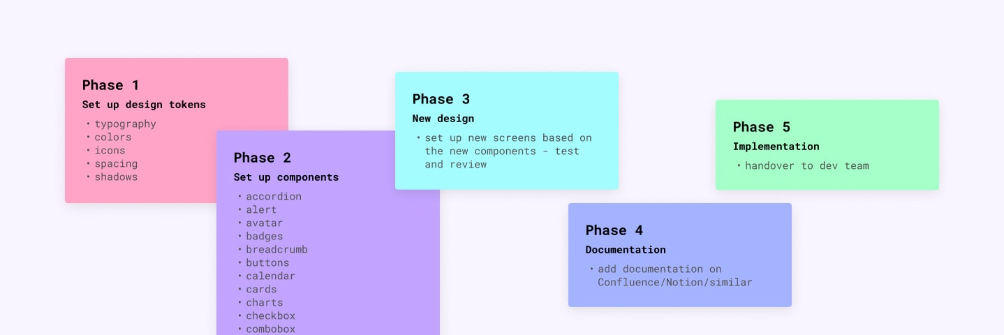
Since we likely won't pause feature development, my plan was to
implement the system gradually. Over the next few months, we’d cover
everything without interrupting ongoing work.
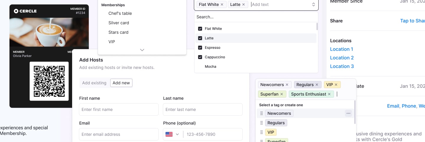
In the end, this approach laid the groundwork for a more organized and scalable system that will grow with the product.